
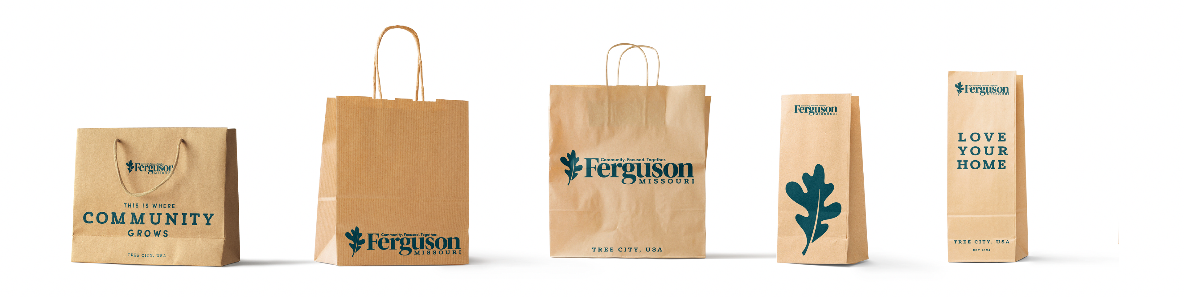
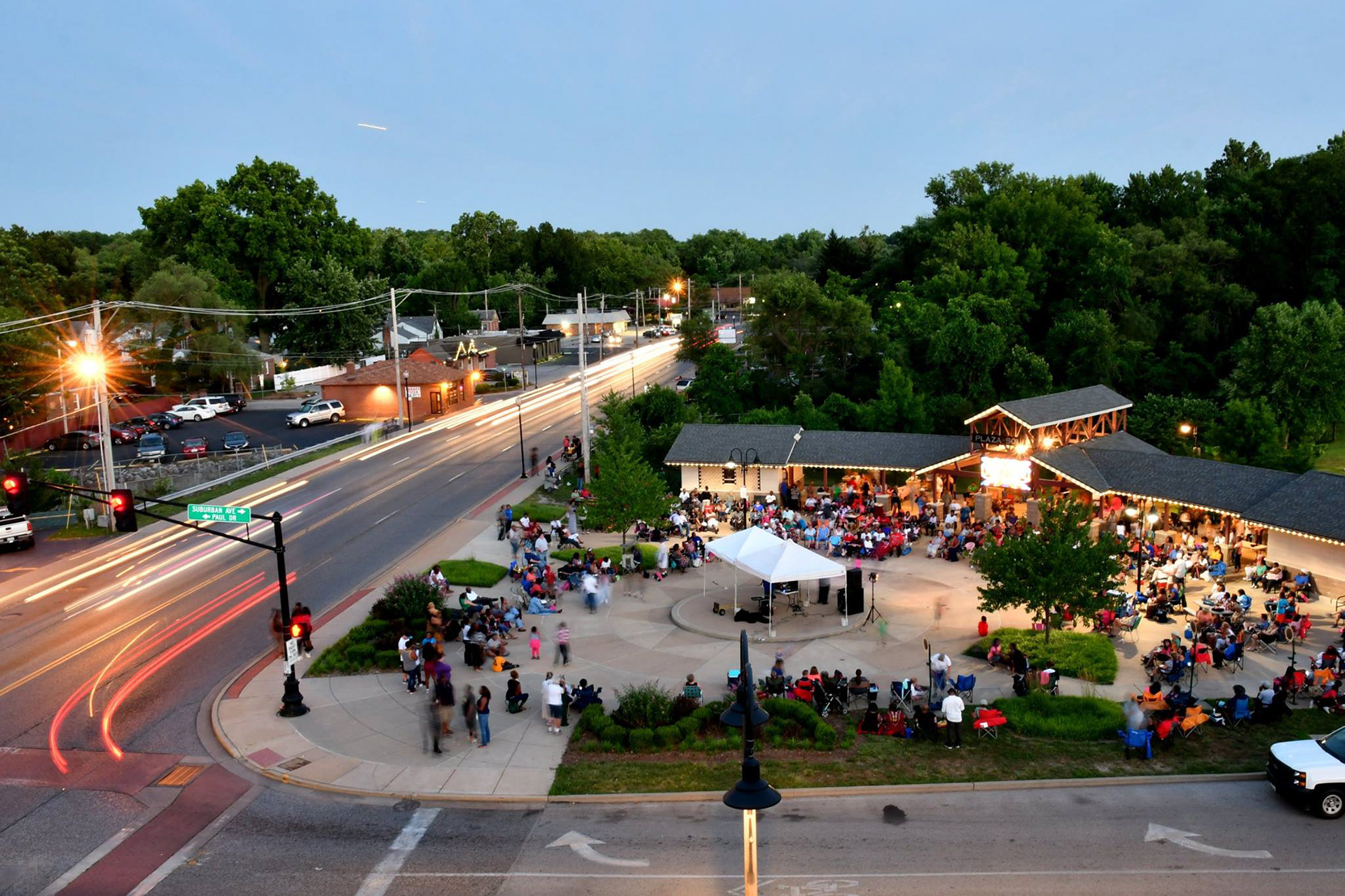
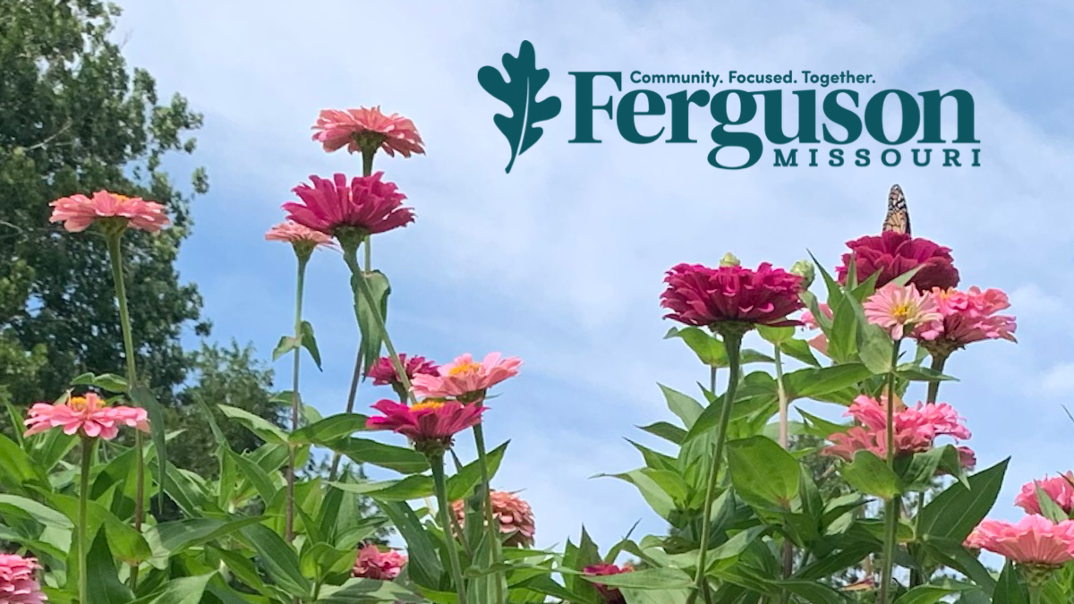

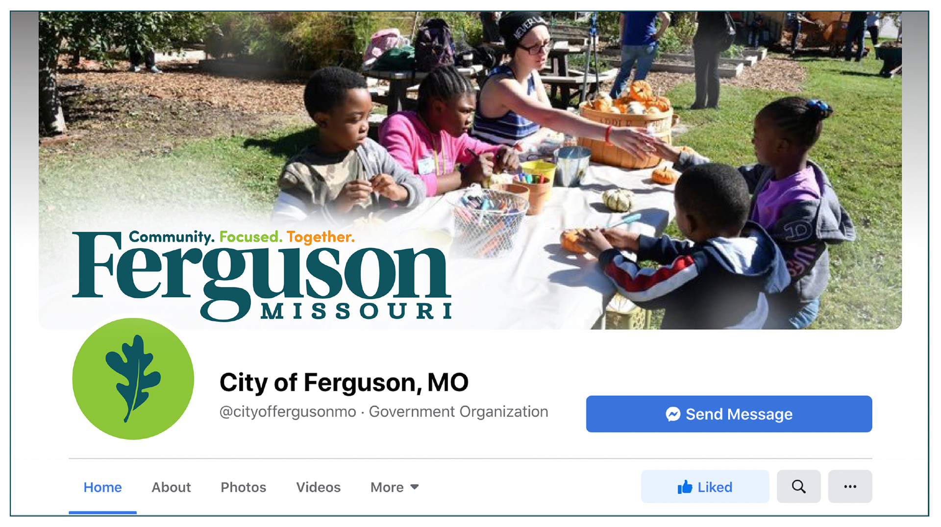
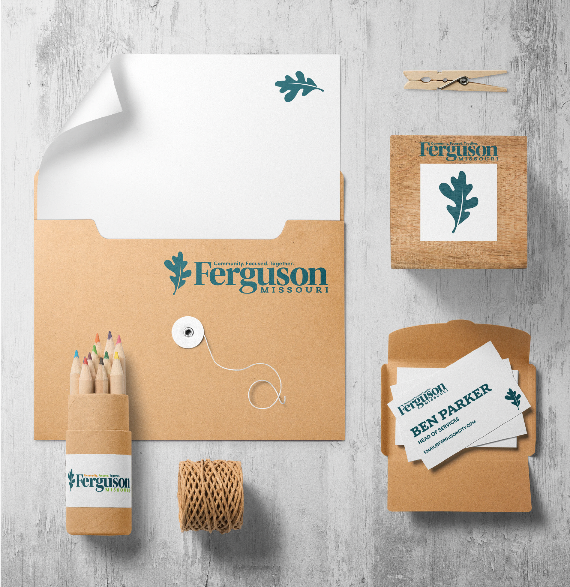

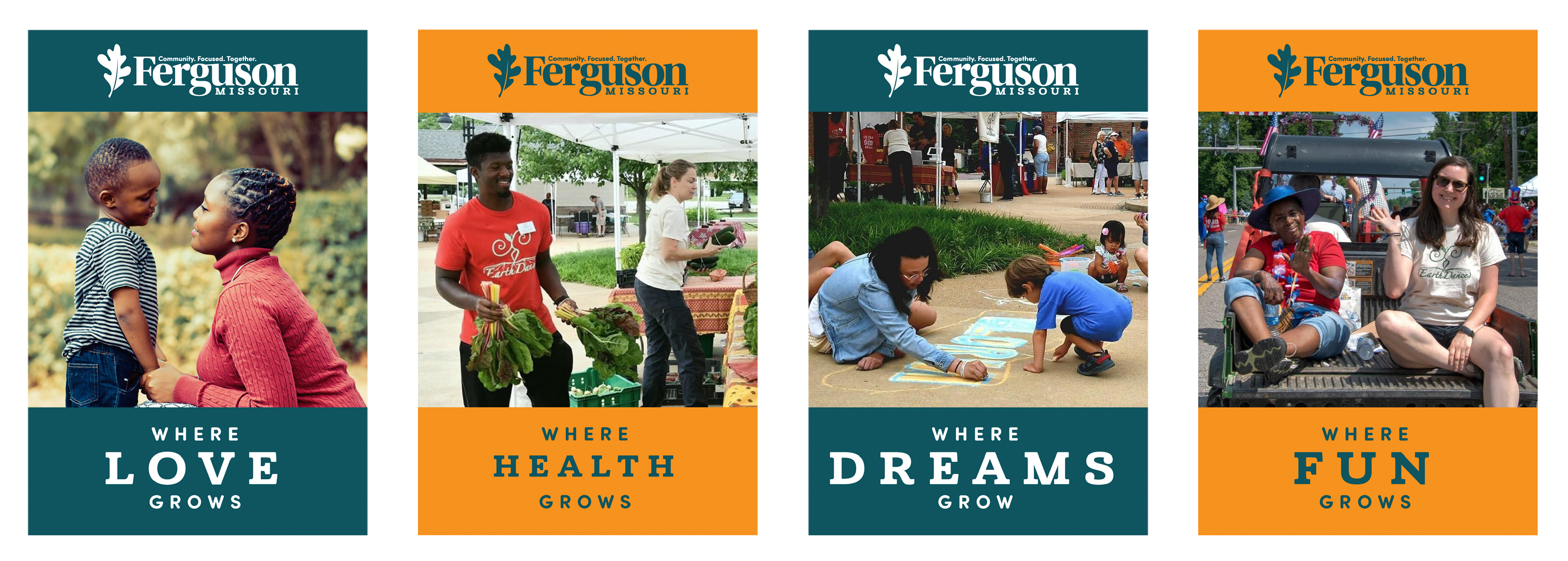


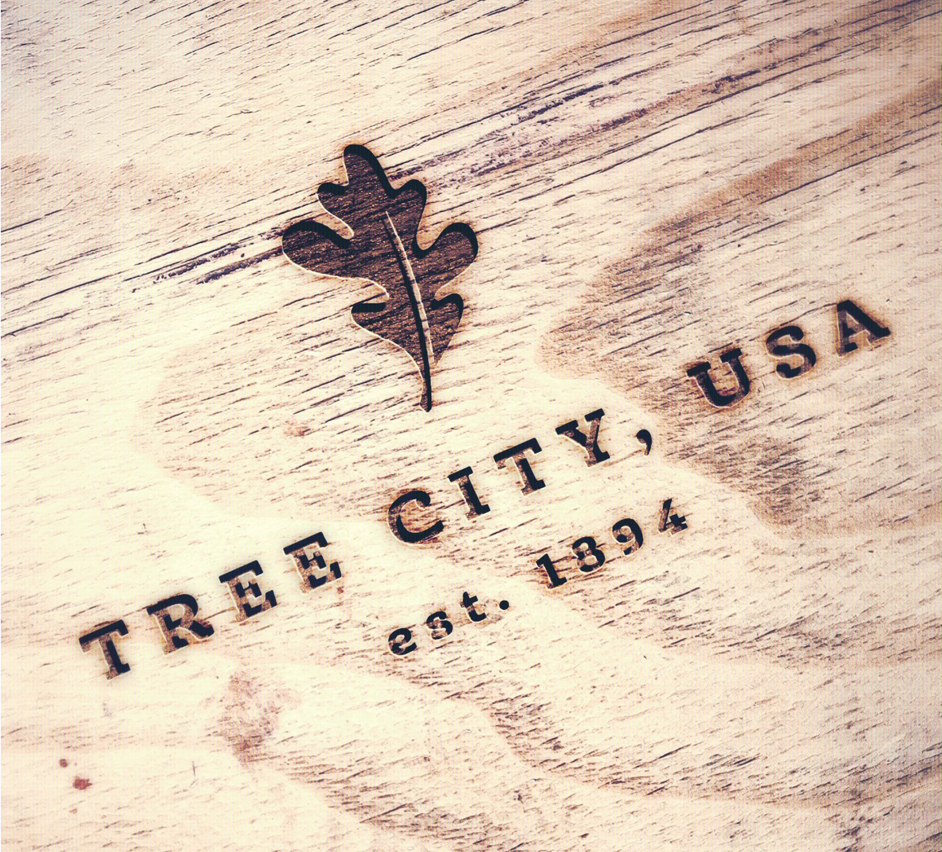
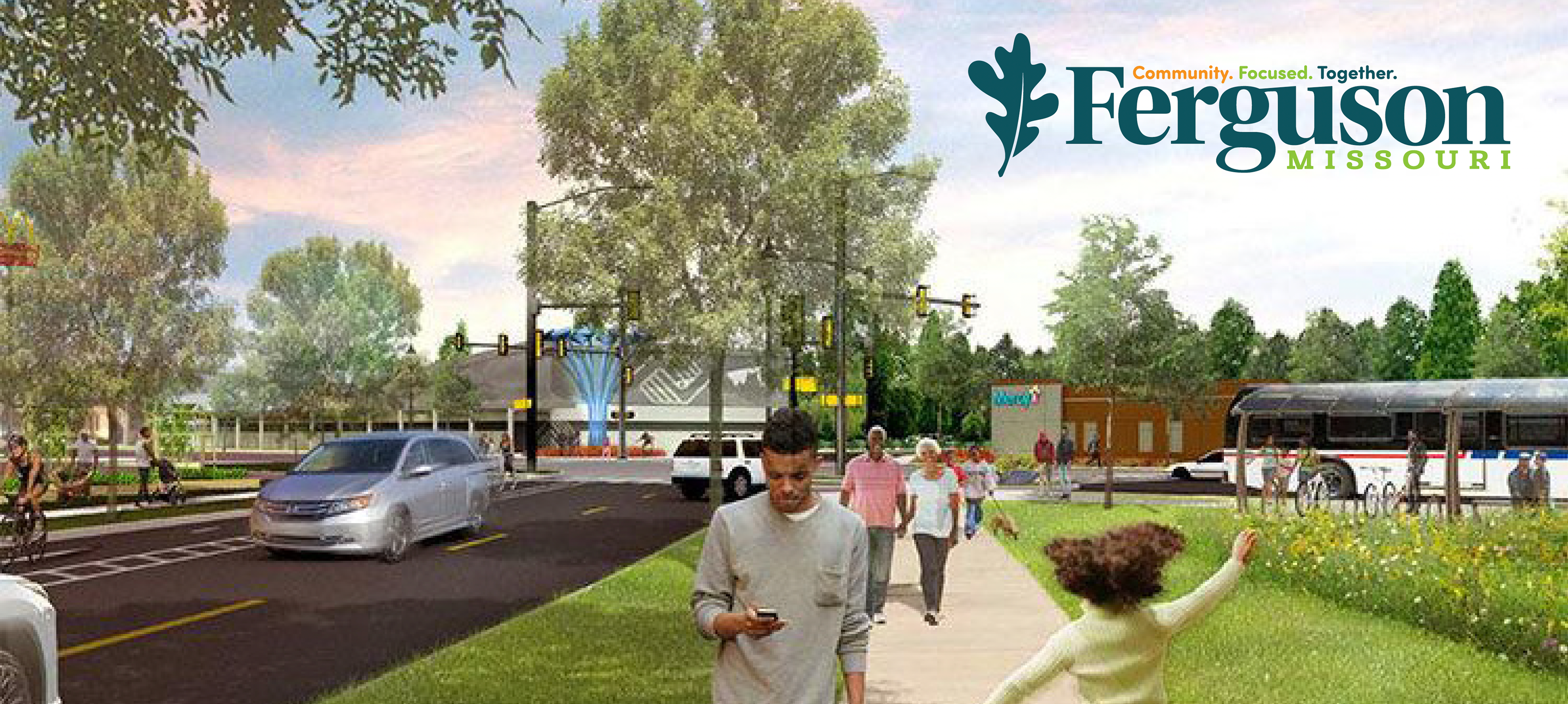
The City of Ferguson was faced with a difficult task - modernizing and rebranding their town after tremendous civil unrest. For this project, I looked to the roots of the city, which was founded in 1894 as a farming community, and explored the ideas of growth and unity for the town’s new identity moving forward. One of Ferguson’s most distinctive and treasured features is its abundant natural spaces, so much so that it is honored as a Tree City USA recipiant. Ferguson also prides itself in a thriving Farmer’s Market, organic farms, and plentiful community gardens. Using Ferguson’s agricultural past, its natural gems, and its hopes for a strong future, the white oak leaf presented itself as the perfect visual and symbolic mark for the new brand. For the color palate, the main color is close to Ferguson’s old shade of green but is combined with a more vibrant shade of green and orange, staying within the natural shades of the colors seen in trees around the community, but still bright, fun, and modern. Leaving behind antiquated imagery of railroads and Victorian architecture also present in the city and focusing on its natural beauty was definitely the right move for showing the city is ready for a strong and healthy future.